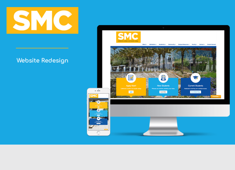
This project was completed as part of a class at Santa Monica College. My team and I were tasked to redesign the SMC (Santa Monica College) main website. The goal was to create a successful redesign by identifying the needs of the user and making it a truly enjoyable experience for them. This was done by implementing research, organizing content and applying the new branding being developed by an outside company and creating a responsive design.
Details:
Duration: 12 weeks
Tools:Photoshop, Illustrator, Balsamiq, WordPress
Team: 4 designers Project Manager
My Role:
Performed competitive analysis
Worked on the Budgeting
Worked on the UI Design by creating a high fidelity prototype
The Challenge:
Can we consolidate and organize the endless amount of data and information to create an enjoyable experience for site visitors?
Summary
As a SMC student I visited the Santa Monica College website multiple times a semester and always found it difficult to navigate. Santa Monica College wanted to refresh their online presence and brand identity to promote the college’s unique approach and vision to a global audience.
What I did specifically
Team Leader
Client Survey
Competitive Analysis
Personas
Communication/Project
Brief
What I did specifically (continued)
Estimate + Schedule
Sitemap
Sketches
Wireframes: Homepage + Landing page
Design Comps
WordPress Site (3 pages)
Client Survey
During our client survey we discovered that the main reason for the redesign was that the site was not responsive, outdated and was not competitive against the other Community Colleges in the area. The goals for the new site was for it to be engaging, forward thinking, and innovative while maintaining the new branding created by an outside design firm.
Competitive Analysis
We performed a competitive analysis of the other community colleges in the Greater Los Angeles Area. Most community colleges offered unique content targeted to specific audiences. SMC mostly targets the international community of students. We used Xtensio to make this process easier.
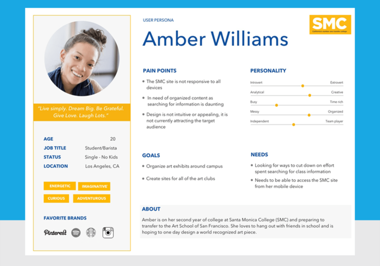
Target Audience + Personas
Target Audience: Students, International Students, Faculty, Employees, Professors, Alumni, Community Members, Potential Students. Students Age Range 18-28, others range from 40-55 year olds.
Amount of time spent on site: Research from the SMC Site Administrator shows that a typical session for a user is 15 minutes, they search the site for needed information.
Device site is accessed on: Most visitors are using their smartphones to access the site. Income is in the low to medium range.
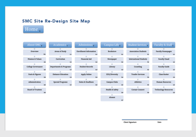
Site Map
As an independent assignment I analyzed the current SMC site and created a sketch of the site map first, I rearranged the navigation to make more sense and renamed any confusing nomenclature. Then I began organizing and removing any unnecessary links and redundancies. The final solution was six categories in addition to the homepage. Each category on average would feature 4-6 pages.
Wireframes
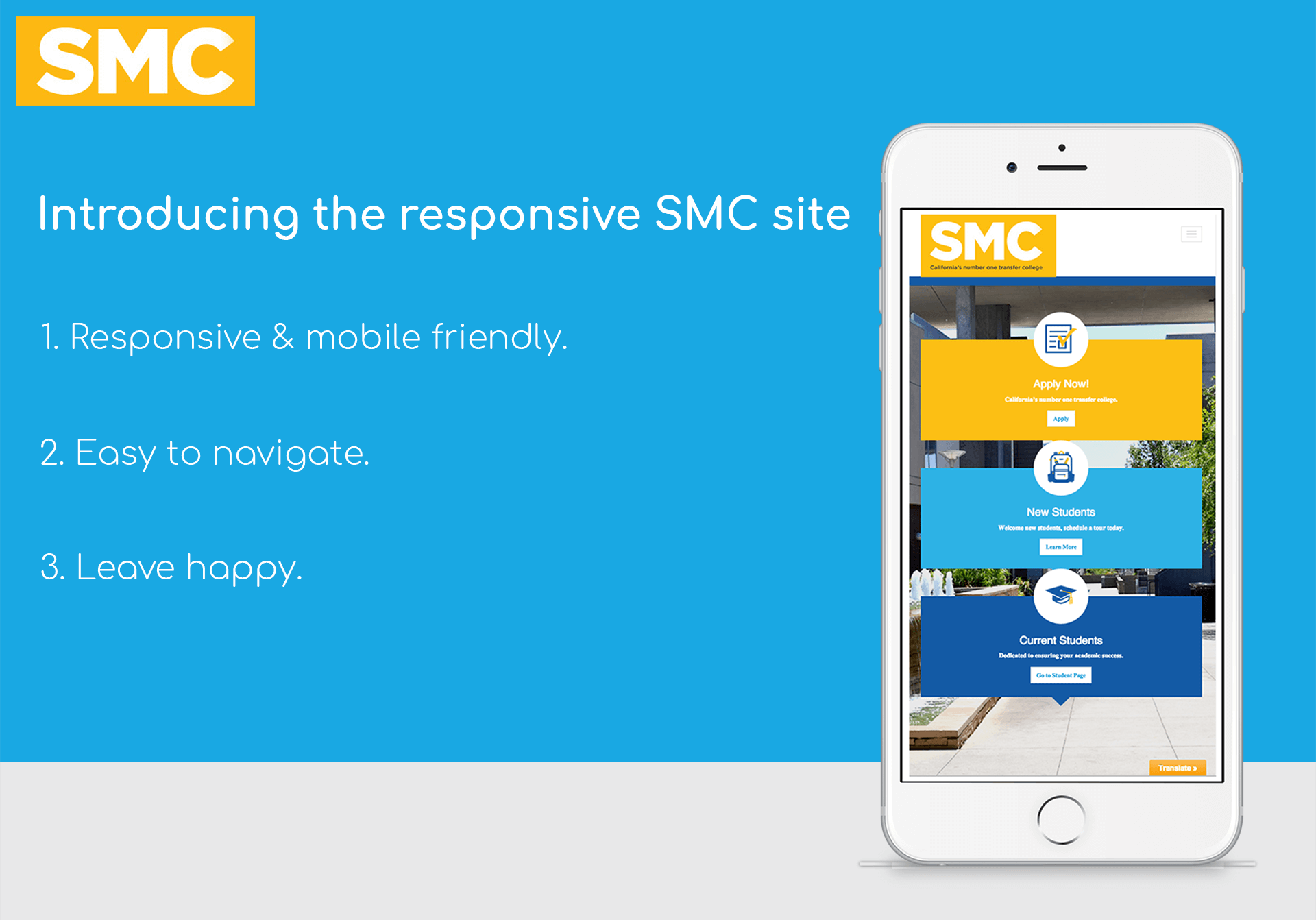
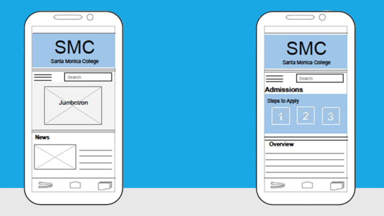
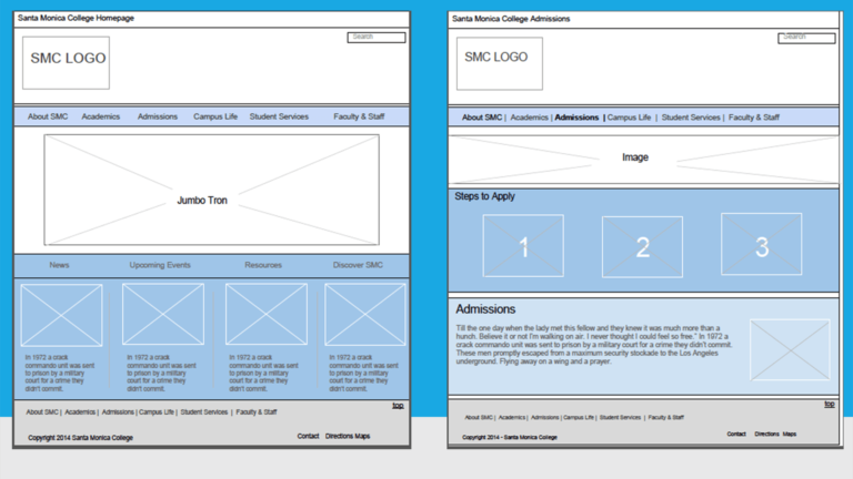
Having an overall idea of the direction for the redesign I began creating wireframes for the three breakpoints, mobile, tablet and desktop. I considered the primary goals and the audience for the site. Mobile pages should only include the important content of a site in an easily viewable layout meant for a small device. I focused on three sections, for the homepage the first section contained the logo, below that, I placed the navigation menu in accordion style dropdown and a search bar.
In the second section the jumbotron slideshow with details on the images about events, programs, or other information that needed to be highlighted. The last section was for a news section with an image and the text column to the right of that. For the second page, the admissions page the first section was consistent with the layout of the homepage, we added three icons in the second section that represented three steps to apply for admission, in the third section we added a paragraph overview. We used Balsamiq to wireframe more easily in this process.
Design Comps
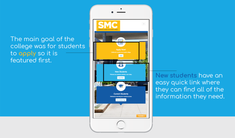
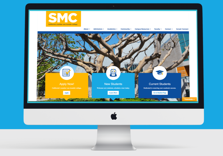
For the design comp, I worked on two pages in three sizes to give the new SMC a new look. I started the visual design for the pages by creating a complementary color scheme to go with the revised logo. I chose a sky blue that complements the orange in the logo perfectly and as SMC is so close to Santa Monica Beach, the blue represents the ocean. For the typography we chose a standard font that would read well on all devices, we chose Helvetica in Regular and used the Helvetica font family throughout the design. For the homepage we chose a large image of the campus with three sections with icons known as the “call-to-action”. These are the main focus of the college for students to be able to “apply now” a section for “new students” and a section for “current students.” The team chose my design and we proceeded to make adjustments to all of the pages to reflect this design direction.
Creating the WordPress Website
We purchased a WordPress theme that was geared towards education. We split the work into 3 pages each totaling 12 pages for the high fidelity prototype. The end result was a site with a clear navigation system, a successful sub-navigation system, a strong visual design. As project manager, I performed a test on all of the pages to ensure quality, branding cohesiveness and functionality. It took about eight weeks to complete the site prototype with 12 functioning pages. We presented the site to the SMC stakeholders and they were very please with the outcome.
Conclusion
In conclusion, this project was an overall success for all parties involved. As a team we successfully redesigned the site and created a responsive website for our client. In the end the project satisfied the users’ end goal which was to have access to a mobile friendly site with clear, well-organized content. The stakeholders’ end goals of increasing the visibility of the college and maintaining its status as the #1 transfer college to and remain competitive in the market were also met.